
The design of your website’s homepage can have a huge impact on how visitors perceive your brand. It will affect their first impression of your company and can mean the difference between someone buying from you or leaving your website without browsing any further.
There is a range of web design tactics you can use to make more sales and earn the loyalty of the shoppers who land on your website. Read on for our top tips that will help you to do the best possible job of designing your homepage.
Make Hiring Or Buying From You Very Simple
You want to make it as easy as possible for people to graduate from your homepage to your checkout. Online shoppers tend to be quite impatient and are huge fans of convenience. So, if you can ensure the process of browsing your website and hiring you or buying your products is as quick and simple as possible, you’ll win yourself some new fans and make a lot more sales.
There are a number of very effective tactics you can use to ensure people can take the next step with you quickly and easily. For instance, you could:
- Provide a clear call to action that tells people exactly where to go or what to do
- Offer a sophisticated search tool that helps people find exactly what they need based on some basic information
- Ensure your contact options are easy to find and access so people can easily get in touch with any questions or concerns
Nobody likes to jump through a lot of hoops when online shopping, so the more you can streamline your customers’ experience, the better.
To give you some inspiration, let’s take a look at one company that does a great job of getting its website visitors from A to B without any hassle.
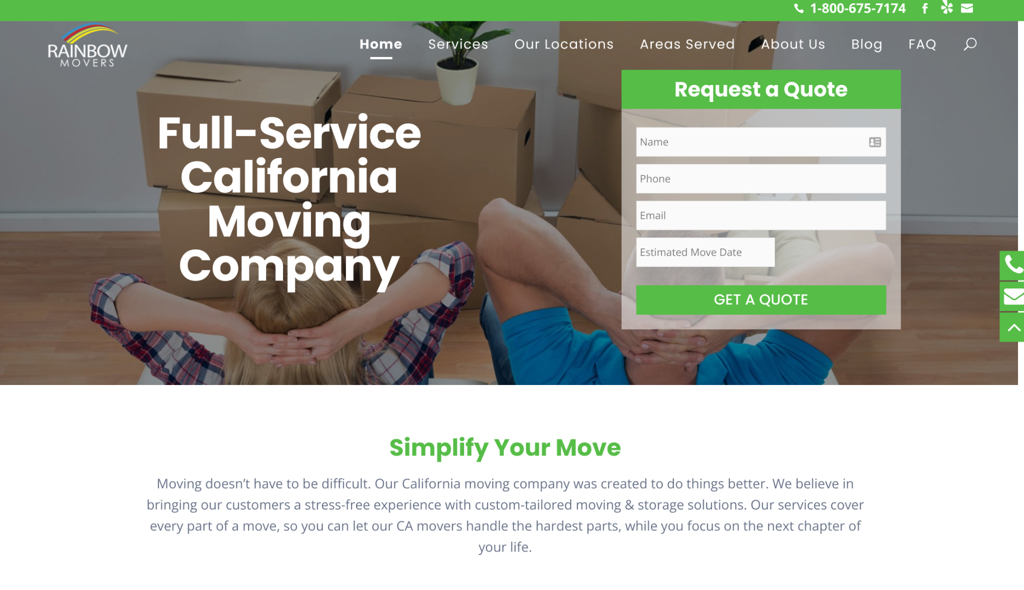

Rainbow Movers is a full-service moving company in California that makes it incredibly easy for customers to move forward in their buying journey from its homepage. As you can see, the design of their homepage presents a very simple contact form people can fill out as soon as they land on the brand’s website. Prospective customers simply need to provide some basic information to access a quote for the company’s services.
The most important thing to note here is that the form doesn’t ask for a lot of details. In fact, it only asks for a user’s name, contact details, and the date of their move. The fact that filling it out is so quick and easy means that a lot more people will be likely to complete the form. So, if you’re hoping to capture more leads on your website in a similar way, take a leaf out of Rainbow Movers’ book and try to simplify it as much as possible. The placement is also important so, for the best results, try to display your form at the very top of your homepage so people can’t miss it. This is likely to do wonders for your website’s conversion rate.
Use Strong Imagery That Will Help You Connect With Customers
First impressions count, so the imagery that you use on your website’s homepage is sure to leave a lasting impact on prospective customers. This means you need to focus on choosing images that will show your company in the best light and help you build strong connections with website visitors.
There are a range of goals you can achieve with your website images. For instance, you could focus on humanizing your business by showcasing photos of the people who work for you. Consumers prefer to feel like they’re buying from people rather than faceless corporations, so this can help online shoppers to feel a connection to your brand and may push them towards making a purchase.
Alternatively, you could use images of people who represent your target audience to help website visitors imagine what it would be like to use your products or services. You could show people clearly having a great time using your items to communicate to potential customers that they’ll enjoy what you have to offer, too. The images you use can have a huge impact on your online presence, so they need to be chosen with a lot of care.
Let’s take a look at one company that does a fantastic job of using effective imagery on its website’s homepage.
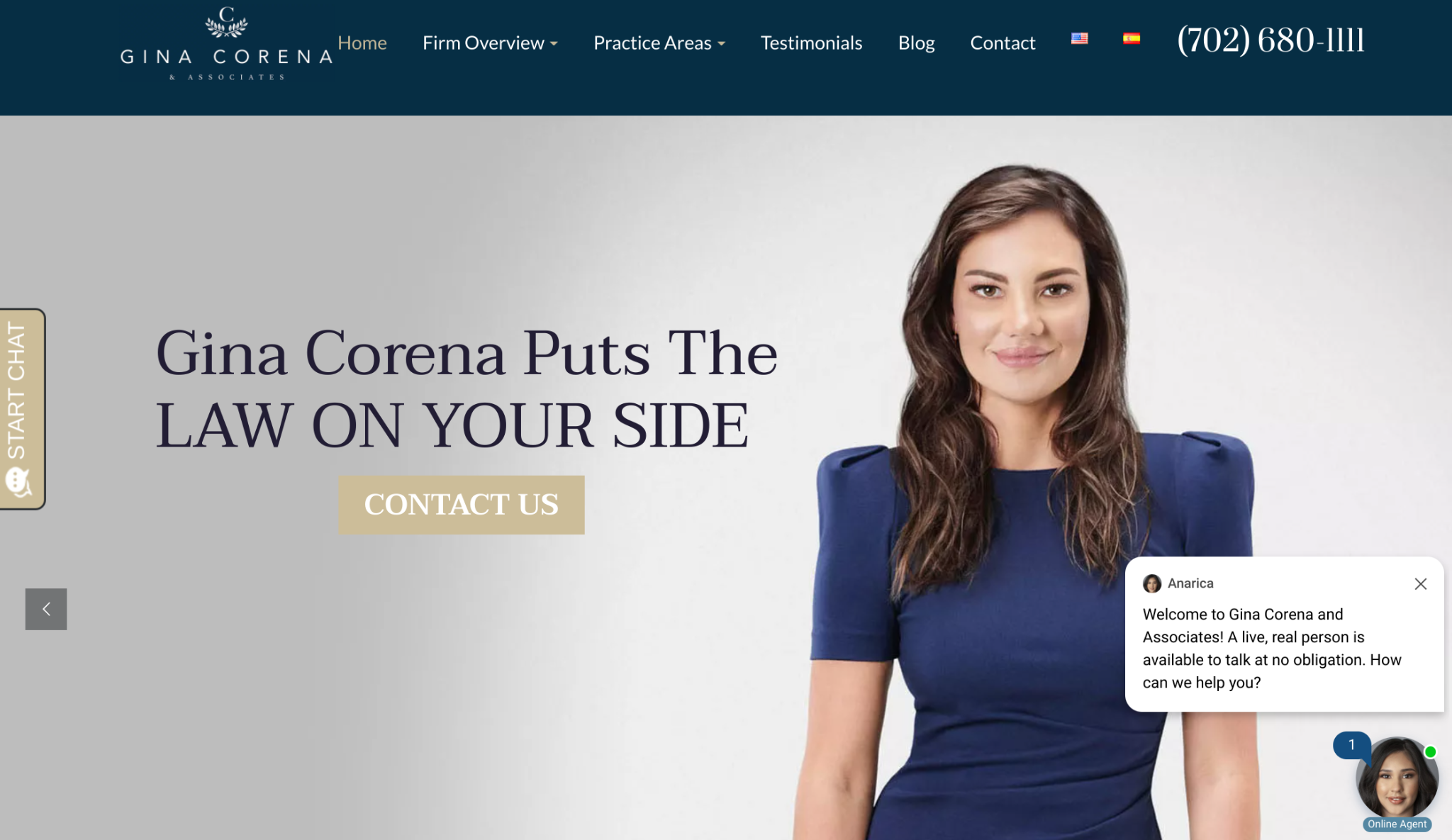

Gina Corena & Associates is a personal injury law firm that focuses on using its website imagery to humanize its staff and build a connection with prospective clients. Anyone looking for a personal injury lawyer is likely to be in a very stressful situation, so they’ll only reach out to companies that they know they can trust. This imagery is great for showing that there are real people behind the firm who are waiting to help people get the results they need.
This is a particularly effective technique for service-based businesses that tend to forge strong relationships with their clients. Nobody will want to take legal advice from a faceless entity that doesn’t really seem to care about the people it serves. By using images of their staff on their homepage, Gina Corena & Associates show that they’re real people who truly care about the cases they fight.
Make Space For Positive Reviews From Past Customers
Another way you can ensure your website’s homepage earns visitors’ trust is by displaying positive reviews you’ve received from past customers. While you may be confident that you’re great at what you do, prospective customers aren’t just going to take your word for it — they’ll want a second opinion. Fortunately, reviews and testimonials are ideal for providing just that.
To collect reviews from your customers, send out post-purchase emails to get their thoughts, and think about quizzing previous buyers on social media. If you’re struggling to get responses, you could even offer an incentive like a discount on their next purchase if they provide you with their thoughts.
The types of reviews you should collect will typically depend on the type of business you run. For instance, product-based businesses can benefit from star ratings that allow customers to compare and contrast similar items, while service-based businesses will usually want to display written testimonials on their homepages to provide visitors with more context about what they’re capable of. You should keep all of this in mind when designing your homepage if you’re serious about boosting your sales.
Ensure Your Website’s Navigation Is Intuitive
If you want to make it as easy as possible for people to find what they need on your website, you’ll also need to focus on ensuring your navigational menu is intuitive. This means, when people land on your website, they should have no questions about where they need to click to find what they’re looking for.
You should keep your menu as simple as possible, and make your labels descriptive rather than ambiguous. You should also use common terms for the different pages of your website — so, for instance, it’s typically best to go with the traditional “blog”, rather than trying to be more creative with a term like “journal” or “inspiration”.
It’s also important to remember that there are a number of different ways you can organize your menu, depending on what kind of business you run. For instance, you may wish to categorize everything by product type or allow people to browse in a certain way depending on who they are. A college may have two menu options for “current students” and “prospective students”, for example.
The most important thing is that you ensure you’re providing website visitors with a positive user experience. So, don’t be afraid to try out some different set-ups and even survey your audience to see what kind of menu they prefer.
Make Sure Your Contact Options Are Easy To Find And Access
Finally, if prospective customers have any questions or concerns, they may wish to reach out to you for answers. And, if your contact options are difficult to find or use, they’ll be likely to leave your website without learning more. So, when you’re designing your homepage, you need to put plenty of time and thought into ensuring your contact options are front and center.
The first step will be to decide which contact options you’re actually going to offer. The most common tend to be phone, email, instant messaging, and social media. The best options will depend entirely on your audience. You’ll usually find that older demographics prefer to communicate by phone or email, while younger generations are more comfortable with instant messaging and social media direct messages.
Once you’ve chosen your preferred communication channels, display them loudly and proudly on your homepage. You could add your phone number and email address to your header, or have a pop-up instant messaging window that greets customers as soon as they land on your website. This can all make it very easy for people to get in touch when they need to, which is of the utmost importance if you want to provide great customer service and avoid missing out on any sales unnecessarily.
Summary
Your website’s homepage will serve as your business’s online storefront, so you need to ensure you get the design right. In this article, we provided you with our top tips to help with this, which include creating an intuitive navigation, showcasing positive reviews from past customers, and ensuring your contact options are easy to find and use.
Would you like more help with growing your venture? Check out Techdee’s business section, where you’ll find even more tips and advice that will help you to thrive in your field.
—
Author bio & headshot:
Adam Steele is the COO at Loganix, an SEO fulfillment partner for agencies and marketers. We build easy-to-use SEO services that help businesses scale. If you liked this article, please check out our SEO guides and templates on the Loganix blog.