
Posters are one of the best advertising tools for companies. Although regularly used, companies need to be careful when creating and printing posters to attract attention.
Posters are usually viewed by individuals who are on the move. It should only take them one glance to recognize and understand a poster. If the poster takes a lot of time to read, there are very minimal chances its message will be understood.
Therefore, you need to determine the best font size for your poster to catch your readers’ attention. Here are a few things you need to consider when looking for your poster’s best font size.
Poster Font Guidelines for a Professional and Easy to Read Poster
Other than being readable, a poster needs to use any available white space creatively. The controlling element in any poster has to be what the poster is advertising or marketing – there should be no confusion. To do this:
Think About Your Target Market
Although you can create a poster for a specific audience, you must create one that attracts a wider audience. As such, as you design the poster, think about the different types of people you want to convey the message to. Some of these peoples could include skimmers and readers.
Skimmers:
These are people who read a poster without reading every word. For instance, they can read the title of the poster and any other prominent text, and that’s it.
Readers:
Readers generally spend more time on a poster because the text contains information that directly addresses their needs. People can only read the entire text of a poster if they are interested in the topic or converted skimmers.
Creating an Easy-to-Read Poster
To create an easy-to-read poster:
- Ensure your company’s name or your name is prominent throughout the poster.
- Pick a title that is relevant to your theme. The title also needs to have some level of creativity.
- Use as few words as possible to state your main point.
- Ensure the poster can be viewed under different resolutions
- Do not use caps because it makes you look like you are shouting.
- Avoid using more than two different types of font on a single poster.
- Avoid centering text.
Font Size
Your font will largely depend on the amount of information or content you want to use. You need to ensure that everyone in your target audience can comfortably read the text in your poster. However, the font size should not also be too big.
To develop the right font size for your audience, create your poster using the available default size. The standard size will help you determine the extent to which you can resize your content depending on your amount of content and/or layout you use.
You should not create a layout or try to perfect an existing layout while adding more content to your poster. Creating/perfecting a layout and/or font size should come at the end – this will save you a lot of time.
What You Need to Know When Making a Poster Using PowerPoint
Since PowerPoint is readily available for most people, it can help you create a great poster within a short time. However, the program has a page size of 56 inches, making it challenging for those who want to create larger posters. The good news is that you can still create a poster that is larger than 56 inches.
If you want to create a more than 56 inches poster, you need to create a document that is half the final size of the poster. While sometimes you may make a poster size that is as small as 8.5 by 11 inches, on most occasions, you may need to create a poster that is as large as 48 by 72 inches. In this case, the 48 by 72 in will be printed from a 24 by the 36-inch document.
Therefore, if you want to create a poster that is has a font of 36, it needs to be 18 on the PowerPoint document. The recommended minimum font for a poster includes:
- 18-point for captions
- 24-point for body text
- 36-point for subheadings
- 85-point for the main title
Font Style
Whichever style you may decide to use, the primary goal is to make sure the poster is easy to read. Font styles allow you to customize your text and determine how your text will appear on the poster. Here are a few tips to consider:
1. Use Fairly Standard Font Styles
PowerPoint has a wide selection of styles that can help you design a poster. To make the most out of your presentation, stick to a standard font for your text, and ensure your presentation is uniform. However, you can use two different font styles for visual interest. Some fonts you can try out include:
- Times New Roman
- Calibri
- Arial
- Georgia
- Tahoma
- Myriad pro
2. Incorporate Contrast
Irrespective of the font you select, readability may not be very easy if there is no adequate contrast. There should be a contrast between the text itself and the poster background. You can opt for a dark background with light text or a light text background with dark/black text.
When incorporating contrast, you need to consider the environment in which the poster will be used.
3. Do Not Use Scripts
Although handwriting, novelty typefaces, and scripts may seem pretty and interesting, they are often hard to read. That’s because there is often not enough size or contrast to make handwriting, novelty typefaces, and scripts readable from a distance.
Other Helpful Poster Formatting Tips
Spacing ad layout
- Use a 1-inch margin when creating your poster
- Always use a ruler – found on the right side of the PowerPoint slide
- Use the grid and guides option if you wish to use a lot of pictures, graphs, or text boxes
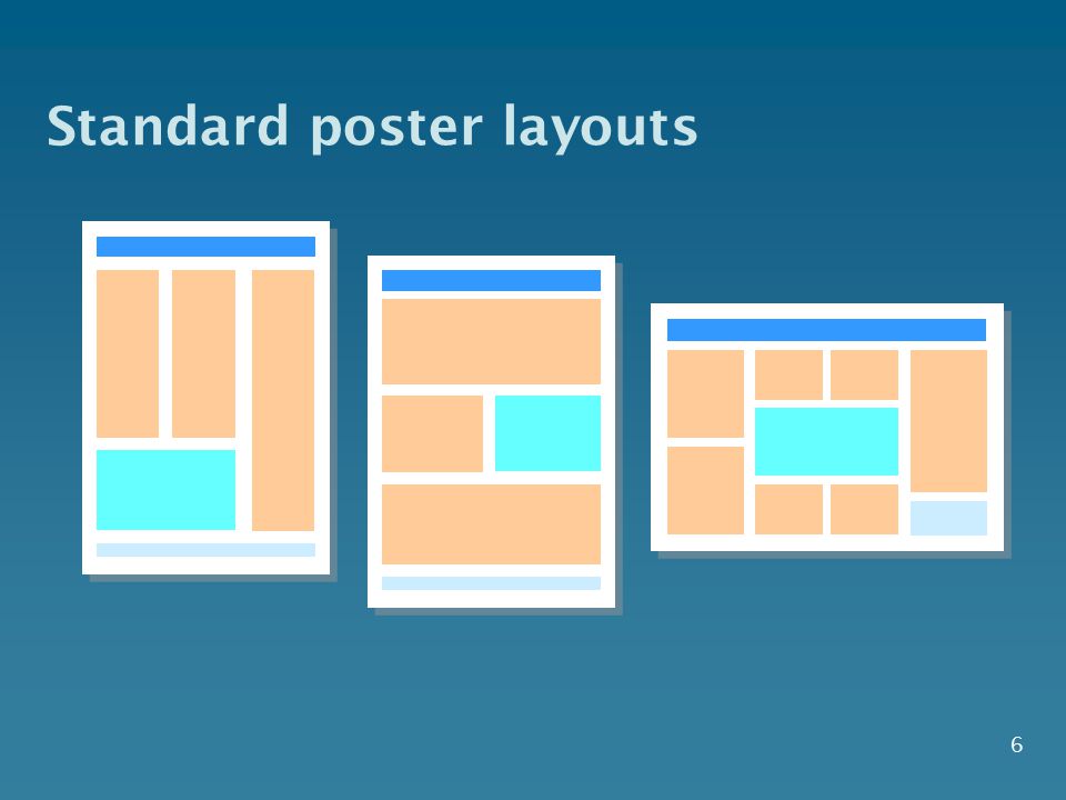
- Use columns for content
- Ensure your text is evenly distributed between the margins
- Spacing within and between columns should be equal and consistent
Professional Poster Printing
Are you looking for professional large format poster printing services? At Custom Printing Inc., we take pride in offering high quality and durable custom poster printing services. We rely on modern technology to create oversize prints perfect for everything, from window graphics to framing.
Our prints let you make an impact on your training events, tradeshows, and presentations. We print large format of different sizes up to 64″ x 160ft.
Follow Techdee for informative articles.